Improve: keep track of your data
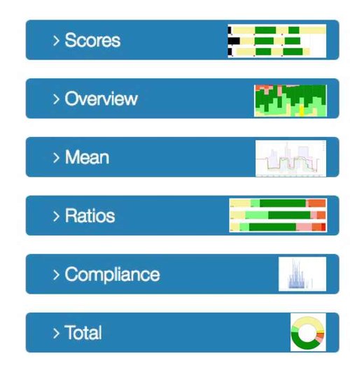
The smart charts, that are viewable after logging in to the Parkinson Smartwatch website, provide clear visual representation of the information that you have used your watch to put in your electronic diary.
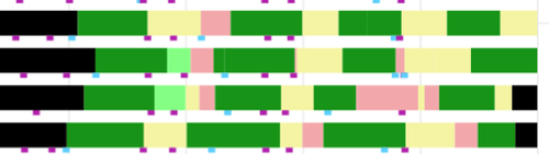
The chart SCORES resembles a calendar: each bar is a day (4 days are shown in this example). The colored parts of a bar represent your choice at the “rainbow’.
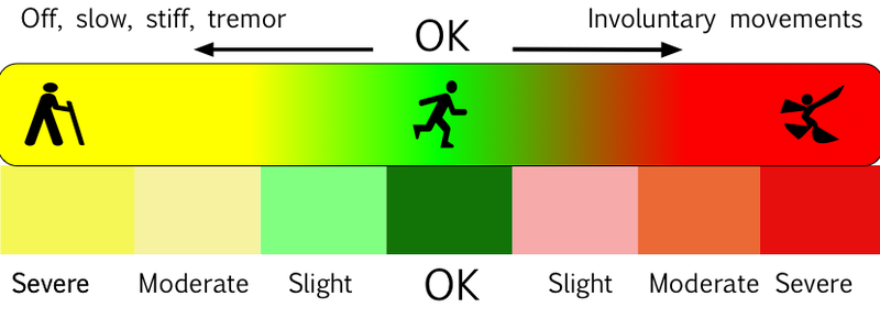
This figure shows how the continuous colors of the rainbow are transformed to bar-colors, using seven equal intervals.
Lightblue boxes indicate a meal, purple boxes indicate ‘taking pills’
You find this legend also at the right-hand side of the chart.
