A first impression
This is the Parkinson Smartwatch. It is designed to record and measure fluctuations in Parkinson's disease (PD). It is very easy to use.
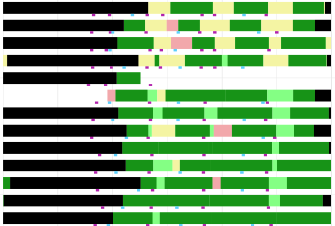
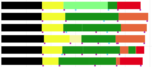
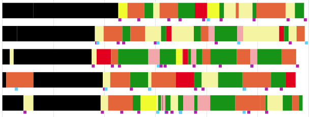
This is an example of a chart that is generated with it:
Yellow means off, green is on. You may recognize wearing-off periods.
The purple squares indicate medication moments (actual intake).
The main instruction for patients to create a diary like this is:
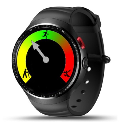
Tap this 'rainbow' at your watch, yellow = off, green is ok, red = dyskinesia.
Do it again if you feel change.
The more severe, the further away from green.
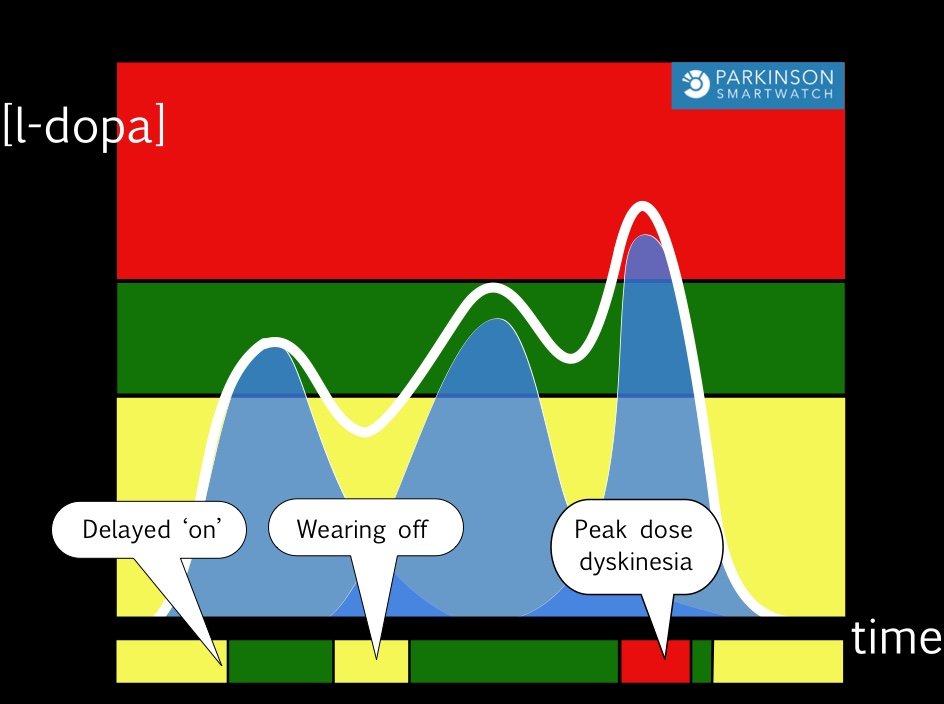
The principle behind is a pharmacokinetic model.
Two thresholds (MIN & MAX) determine the therapeutic window.
Levodopa-levels below 'MIN' result in OFF periods (yellow).
Levodopa-levels above 'MAX' result in Dyskinesia (red).
Green is the place to be, 'on' means response without side effects.
The bar at the bottom shows the resulting clinical course during this day.
Our diary wil show such daily bars. You just saw how response depends on a dose-profile. You can invert this process mentally: i.e. to reconstruct the course of the levodopa levels (the white line) from the bar at the bottom ( the diary).
Simply using 'yellow is too low, red is too high' will help.
Now you can adjust the treatment schedule with more confidence and effect.
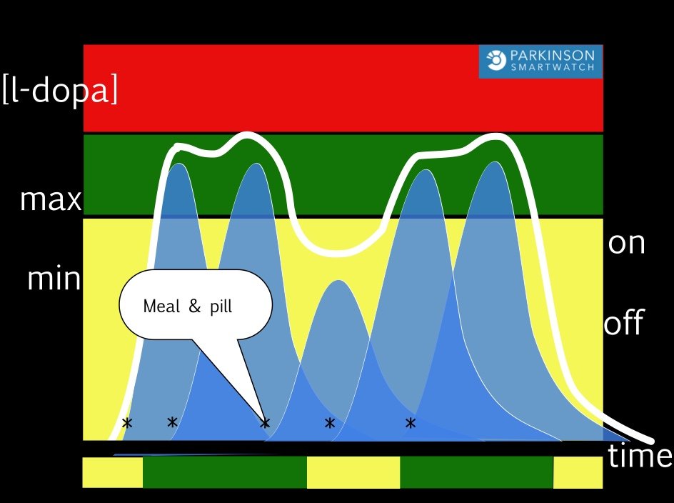
As a somewhat simplified version of real life (like every model), this model it is very useful in clinical practice in most patients with fluctuations. Please beware of signs that may prompt you use an adapted model, like in diphasic dyskinesia, where dyskinesia are not related to a 'MAX' threshold, but to rapidly changing levodopa levels.
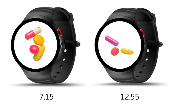
Patients are supported by the watch to increase medication compliance.
The watch reminders can buzz and beep, but also show a picture at the correct moment.
At the personal webpage, the list of medication reminders and each picture can be set as needed.
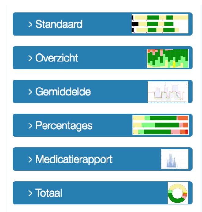
These are several charts that enable you to get a quick impression of the course of disease.
Too much yellow means undertreatment, too much red overtreatment.
Fractions of each category, as shown in RATIOS or in OVERVIEW are ideal to monitor the effect of an intervention, like changing the schedule. TOTAL presents a quick impression of quality of life.
All charts can be tailored: choose start or end date, pan, zoom or save.
This is an example of dopaminergic dysregulation syndrome. Our website has several examples to recognize patterns.
